Effective Storytelling

Although this may be an unpopular opinion, I wasn’t quite blown away at the International Spy Museum. I thought that the museum prepared beautiful, colorful, and lively exhibitions but I couldn’t help but feel like I missed a certain depth in the information. The part where I felt like the museum did the best job with effective storytelling was the James Bond exhibit, “Exquisitely Evil: Fifty Years of James Bond Villains.”

The exhibition had quite a bit of depth: long videos to help introduce the cast of characters, some great text panels, and tons of objects that were used in the actual films. I particularly enjoyed seeing the teeth that Jaws wore in several of the Bond films.

17668641_10155956286532926_379912272_o

Villain Jaws’ teeth from the Bond movies
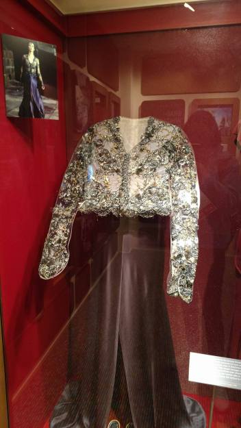
17668681_10155956286427926_1273045858_o

Dress worn by female villain, Elektra King

It was very disappointing to hear that this exhibit would not return to the new building. I understood, of course, since the museum actually didn’t own any of these objects. Perhaps that is where some of the issues lie for the Spy Museum. The museum was littered with great, short and interesting stories. However, as a visitor, I felt I missed out on the context and often yearned for collection objects to correspond to such stories.
17692890_10155956287577926_457653124_o

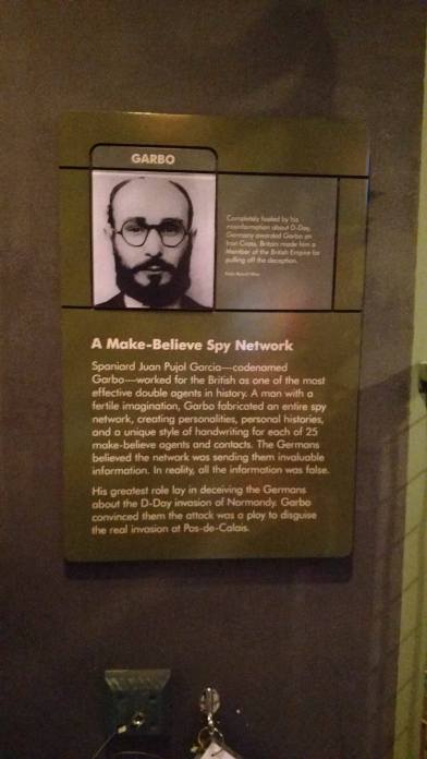
Story of Garbo at the Spy Museum

One such example was the story featured above in the photograph. I had never heard of a man that fabricated an entire spy network to fool the Germans. I thought that this was such an interesting and unique story, but beyond the photograph on the panel, the museum didn’t provide much else. The museum set up the scene for great stories, but didn’t actually follow through with them. It was also overwhelming to jump from story to story within the same gallery.

It was refreshing to hear from the staff that they are aware of this problem and are intending to deepen the visitor experience in the new museum building.

Telling Difficult Stories

Today, we visited the United States Holocaust Memorial Museum. I had visited about 6 years ago, but I was excited to see what I may had missed previously and any new additions. I arrived early to the museum and an exhibit caught my eye. “Daniel’s Story” was an exhibit located on the first floor of the museum. The exhibit was aimed at children, but I was eager to see how museum staff presented the Holocaust story to a young audience.

17571990_10155953800747926_1664760762_o

Diary image in “Daniel’s Story” exhibition

A short film began the exhibit and then visitors walked through Daniel’s life, scene by scene. Handwritten diary entries were placed in each room and helped tell the story. Daniel’s story began with happy memories and scenes from the family kitchen, home, and community.  Then, the entries got darker as the exhibition progressed and the scenery switched to the ghetto and concentration camp.

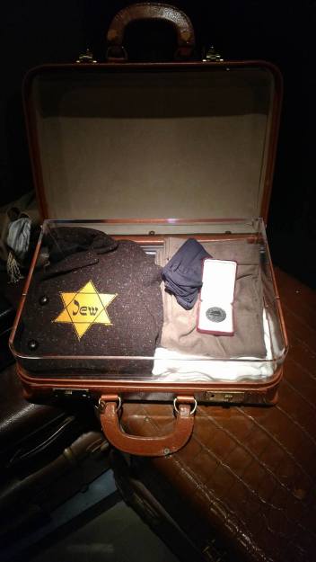
17668964_10155953800722926_338797262_o

Daniel’s suitcase, after being forced into the ghetto

This really fit in wonderfully with our group projects since the entire exhibition was a mode of storytelling. It also did so primarily through objects and written text. Sounds were also utilized. Happy and pleasant sounds of a child helping his mother in the kitchen were at the beginning of the exhibit. Darker sounds, like terrified children and chaos, began to play after the Nazis came to power. At the end, there was an eerie silence as the hallway exit space narrowed, forcing visitors to leave single-file. It seemed symbolic as I could picture Jewish men, women, and children lining up in this manner into cattle cars, in the ghetto, and at the gas chambers.

I thought the storytelling was really appropriate for the audience and touched hard topics without being overwhelming for the children. While I really enjoyed the “Some Were Neighbors” exhibit, I didn’t think it would be a suitable place for families with young children to learn this story. I also thought that a warning by the shooting video should have been included in order to protect young minds from graphic images. Still, I was pleased that the museum had formulated a great exhibition space aimed at children.

Bastille Key at Mt. Vernon

large_centralpassage2

Bastille Key at Mt. Vernon, courtesy of Mt. Vernon Ladies Association

The Bastille Key, the cast iron key to the main prison in France, was given to Marquis de Lafayette following the Storming of the Bastille on July 14, 1789. Lafayette, at the time, was acting as a commander of a local protection force aimed at keeping the peace in France. He passed on the Bastille Key to George Washington in 1790. Marquis de Lafayette, of course, was quite instrumental in the American Revolution and held similar ideals as Washington and other Founding Fathers.

101978-004-1ED1897A

Storming of the Bastille, courtesy of Encyclopedia Brittanica

This object is important to George Washington and the American Revolution in general because it represented the ability of a people to overthrow injustice. The Bastille, prior to the Storming, was seen as a symbol of aristocratic power. This changed when citizens of France attacked the Bastille, the local prison and armory. As such, it is remembered as one of the most important acts of the French Revolution. Such obvious parallels can be drawn between the Storming of the Bastille and American Revolution era events like the Boston Tea Party. The Washington family recognized the power of this object and it remained in the Mansion for several generations following Martha Washington’s death. It was only of a few furnishings to remain in their original place in the home.

Although technically a testament to French events, the Bastille key remains a symbol for the larger themes of life, liberty, and the pursuit of happiness. These themes are instrumental to American society and surely make the case for keeping the Key on display at Mt. Vernon.

NMNH: A Kid’s Playground

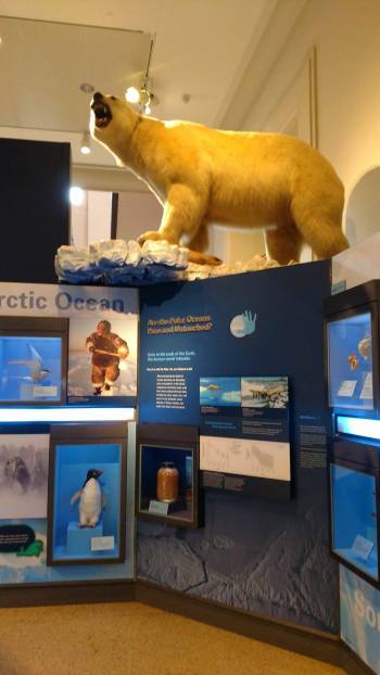
The National Museum of Natural History is truly a kid-centered museum. The walls are covered in bright colors and interactive displays. A large whale hangs high up over the heads of visitors while a giant polar bear looks on from the periphery. The length of a giant squid takes up nearly half of a gallery space. As we were shown around the museum, kids bustled around us shouting things like “I wanna see the shark!” and asking questions like “Do whales live in the ocean?”

17623128_10155950960732926_648954946_o

A large polar bear looks on from the Oceans Hall

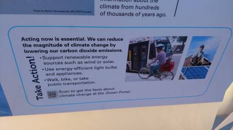
What struck me at the museum was that the NMNH not only provided scientific information, but sought to inform the choices of the public. Many panels told visitors explicit steps that they could take in order to preserve our world as seen below. The photo below shows such a panel in the Oceans Gallery. This approach was even seen in the museum’s cafeteria where trash cans were labeled as “compost,” “recycle,” and “landfill.” I like museums that provide practical information in addition to more abstract and general information.

17623045_10155950960627926_913884190_o

Panel in the Oceans Hall that provided visitors with practical steps to protect our earth

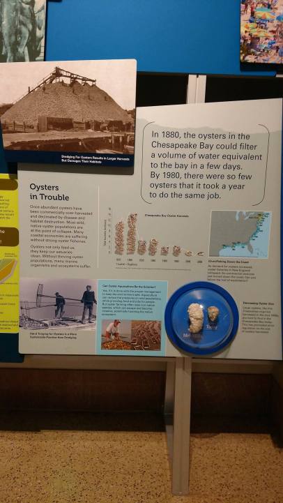
In many instances, the museum used great visual resources to help drive these points home. I was drawn to an oyster exhibit found in the Oceans Hall. A brightly colored panel with great graphs told the story of the Chesapeake Bay’s dwindling oyster population. As this is the main focus of my museum, I knew most of the information. However, actual oysters were utilized in the small exhibit that helped teach a subject that many kids might not be familiar with. These approaches seemed to be successful since the museum was packed full of families with young children and school tour groups.

17622527_10155950960342926_950567116_o

Oyster exhibit in the Oceans Hall

Interpretation of Slavery at Mt. Vernon

17521598_10155946633372926_495110908_o

“Lives Bound Together” exhibition at Mt. Vernon

I was really impressed today regarding Mt. Vernon’s interpretation of slavery. I have never been to this museum, so I wasn’t quite sure what to expect. Some historic sites, especially those that glorify Founding Fathers, often shy away from difficult topics like slavery. I was pleasantly surprised to see the “Lives Bound Together” exhibition. Slavery wasn’t just delegated to a small area in an exhibition, but was the main focus of the entire (large) exhibition.

I enjoyed listening to the Curator as she described the thought process behind the exhibition and how certain objects were selected. I particularly felt it was interesting that many of the same objects in the room with the Washington’s dining table were re-purposed from previous permanent exhibitions, but were interpreted differently under the framework of slavery. I also appreciated the choice to humanize the enslaved people that lived at Mt. Vernon. The choice to display their names on the front door, on a banner throughout the exhibit, and with several silhouettes brought slavery out of an abstract concept.

But beyond Mt. Vernon’s interpretation of slavery in the form of exhibitions, I thought they were particularly successful in utilizing character interpreters. The man who represented Christopher Sheels seemed to have such an eloquent way of describing how he interacts with kids and adults to help them better understand how enslaved people lived on the estate. He said that in order to get his message across he needed to tell the truth, with humility, and with grace. It seemed like a great strategy to utilize, even with tough visitors that could be emotional or downright combative.

Overall, I was not expecting Mt. Vernon to have such a handle on the interpretation of slavery. I was pleased to hear that the narrative of slavery was woven into every tour, even those that didn’t specifically focus on the activities of enslaved people. Staff said that they have come a long way in terms of how they discuss slavery and still have room for improvement. From what I can see, Mt. Vernon seems to be on the right track.

Accessibility at NMAH & NGA

17496347_10155935898542926_2103049976_n

Spark! Lab at the National Museum of American History

My favorite part of today was hearing about the accessibility initiatives at NMAH. I’ve taken the Accessibility course in the program, so this is a topic that really appeals to me. I was fascinated to hear that the Smithsonian’s Accessibility Program only employs two people. In a large-scale institution, I would have expected a larger department that had more authority and power to enforce accessibility measures. However, I was pleasantly surprised to hear about the Spark! Lab initiative. As I have been a volunteer coordinator in the past, I was blown away to hear that volunteers were on-board with the project. Producing new accessibility materials and tweaking program offerings often results in conflict. Luckily, Spark! Lab didn’t seem to deal with any of these setbacks.

I also thought it was great to hear about the internship opportunities for those with cognitive or physical disabilities. I didn’t know that the Smithsonian offered this breadth of opportunities. Even better, these internships seem to be focused on academic areas and not just facilities management. It was refreshing hearing from people that were so passionate about ensuring that all who enter the museum can feel welcome and can access the information.

17505684_10155935898327926_345870761_n

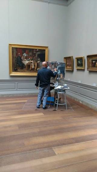
Painters at the National Gallery of Art

I assumed that the experience I had yesterday at Hillwood would be quite similar to the National Gallery Art as both institutions are quite conservative. However, the National Gallery of Art actually exceeded my expectations. The museum was very open to the public. It was great actually seeing multiple painters in galleries, working away. There were less barriers and no ropes to speak of. Since the NGA had a significant amount of security staff, it allowed them to do away with intrusive barrier methods.

Overall, it what great hearing about accessibility programs and actually feeling like the museum was accessible to its visitors. As mentioned at the NMAH, our generation will most likely continue to embrace these initiatives and ensure that all visitors feel welcome.

Text Labels: Necessary?

17495750_10155932660532926_2136225906_n

The cutest panda there ever was!

Today we began at the Smithsonian National Zoo & Conservation Biology Institute. Although I’m pretty local to DC, I actually have never been to the Zoo before! Prior to visiting, I was unsure about the Zoo’s interpretation methods. Although the Zoo does provide interpretation panels and texts, the staff noted that not all visitors utilize this tool. When visiting, I was distracted by the animals, especially the pandas. It seemed like visitors would have a similar experience.

However, what I found to be most useful was our group’s interaction with one of the Giant Panda keepers. I am sure that the keeper provided details that were mentioned in the text panels throughout the Panda House. However, it was easier to pay attention to the information while still keeping an eye on the pandas. During our session with Zoo staff, we were asked how the Zoo could best present information and stories to visitors. Our group suggested a few different approaches: through the use of volunteers, the potential development of apps, or multimedia approaches. In my mind, the use of volunteers or keepers was the most effective. Humans can’t resist cuddly animals. They are more willing to listen to information from staff or volunteers since they can view the animals at the same time.

I’m definitely a “text heavy” person, so this was a new experience for me. As the staff members put it, working in a zoo presents a unique set of challenges. It seems unsurprising that different interpretation methods would work better in a zoo setting.

17496015_10155932660827926_521747614_n

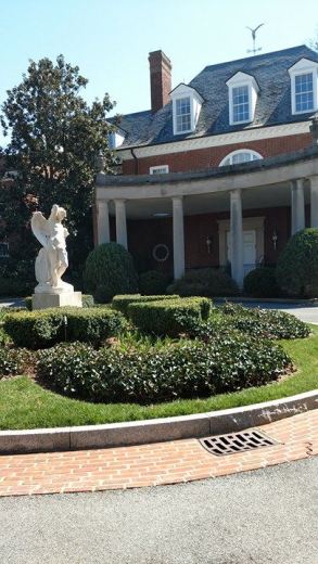
Entrance to the Hillwood Museum Mansion

At Hillwood Museum, I was also drawn to their interpretation methods. The museum attempts to interpret the home of Marjorie Merriweather Post. As is the case for many historic homes, labeling is scarce in the mansion. Other interpretation tools, including an audio guide and a paper guide, were provided to us. As such, I didn’t feel that these tools were effective or allowed me to get an interesting grasp on Marjorie or the history of the home. Walking through the home seemed impersonal, especially amongst the ropped-off rooms.

17409981_10155932660962926_883304348_n

Japanese-style Gardens at Hillwood Museum

Instead, I felt more comfortable outside of the home. I really enjoyed the gardens, the pet cemetery, and the Japanese fountains. I thought that the grounds and the Dacha exhibit were more accessible to visitors and provided much-needed interpretation. Unlike the Zoo, I didn’t have the opportunity to listen to a staff member provide information.

At the end of the day, I thought that the Zoo could get away with less text interpretation since the volunteers and staff were so effective. At Hillwood, I would recommend investing in some sort of text interpretive panels or consider making more rooms in the mansion accessible.

Technology & Objects

The main thread I found today during our visits to the National Air & Space Museum and the National Museum of the American Indian was how technology can affect visitors’ experiences with objects.

17440312_10155928616352926_2022646929_n

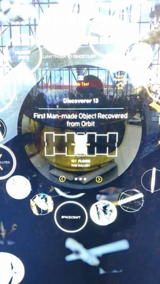
At the Air & Space Museum, I thought this was illustrated through the new interactive “tech” wall in the main lobby. Prior to the demonstration of the technology, I thought the wall was purely decorative. When the staff member began interacting with the wall, I saw just how great of a tool it was. It allowed visitors to “favorite” objects and send them to their phones via the Go Flight app. It also pointed out additional information and even provided a location within the museum (which was my favorite part of the wall).

17440336_10155928616872926_1002585203_n

Tech wall provides the location of an object, “First Man-made object Recovered from Orbit.”

With that being said, the displays around the wall did nothing to aid the visitors. Banners promoted the Go Flight app, but none of the banners mentioned how the tech wall could be utilized! I would have never known about the tool had the staff member shown us how it worked. I believe better signage regarding the tech wall was necessary to ensure that visitors took advantage of the staff’s hard work. In this case, the technology could better serve visitors and allow them more chances to interact with objects. But it seemed like that wasn’t actually the case. Then, we traveled over to the National Museum of the American Indian in order to learn about their new interactive initiatives.

17474895_10155928617857926_1886032162_n

Rotunda of the National Museum of the American Indian

Although I didn’t take any photos of the Indian Removal interactive in the “Nation to Nation” exhibition, this was my favorite part of the day. The interactive not only attempted to provide factual information about the Indian Removal, but allowed visitors to feel some of the same emotions the Native Americans experienced while this process was ongoing. The interactive matched choices of the user to real-life scenarios. I thought that their design choice to use “amped-up” stick figures was very powerful and appropriate. It allowed visitors to look past facial features or cultural stereotypes and instead learn about the treaty process. It seemed that the interactive was very compelling and successful in providing an interactive way for visitors to view museum collection objects and grasp large and difficult concepts. For me, the National Museum of the American Indian’s use of technology was more successful than the National Air and Space Museum’s.

Intertwining Objects

17440279_10155925063662926_2111370229_n

Today, we went to the Smithsonian American Art Museum (SAAM)/ National Portrait Gallery (NPG) and also were able to tour the Lunder Conservation Center. Although I have visited this museum before, I was excited to see the space again. I had forgotten how vibrant the colors were and the variety of the collection.

17392815_10155925063432926_1757754075_n

“Jane Adams,” National Portrait Gallery, Smithsonian Institution. Location: S322

My favorite thing today was the story-telling activity. I chose the Julia Adams (1860-1935) portrait pictured above. I didn’t know who Julia Adams was prior to reading the panel. However, what struck me about the painting was her expression. She seems to be very focused and firm. Instead of looking straight ahead at the viewer, she keeps her gaze to the side and fixed on the road ahead. I also got the sense that she seemed somewhat tired. After reading the panel’s information, I came to the conclusion that it might have been done intentionally. Adams was one of the first women to receive a college degree. In the nineteenth-century, this certainly would have been quite a feat. No doubt, she overcame many challenges in order to meet her goals.

blog_welty

“Eudora Alice Welty,” National Portrait Gallery, Smithsonian Institution. Location: S342

My partner chose the portrait of Eudora Welty (1909-2001), a woman from Mississippi who was an accomplished author and Pulitzer prize winner. Together, we combined the stories of these two collection objects to create an entirely new story. Surprisingly, it wasn’t much of a stretch to intertwine these two portraits.

We presented a mother and daughter story. Jane Adams, acted as the mother to Eudora Welty. From the portrait and object label, we concluded that Adams would be eager to reminisce her struggles and experiences to her daughter during her last moments on earth. As a writer, we believed that Welty would be eager to write down her mothers’ words and later become inspired by them.

Although Adams lived in Illinois and Welty in Mississippi, the story seemed very plausible. The women were very similar; they were trailblazers and a great example of female determination. Both worked hard to complete great accomplishments. I was glad for this exercise today because I realized just how powerful museum objects are. Museum objects can show common struggles and experiences. It was a great warm up for our group project, where we will need to intertwine three museum objects to tell a greater American story.


NMAAHC- What I’ve Been Waiting For!

17439485_10155921637542926_1319296212_n

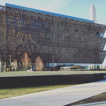
When Phyllis asked which museum we were most excited to explore, I knew that my answer was the National Museum of African American History and Culture (NMAACH). I’ve heard such great reviews from those lucky enough to get their hands on the museum’s coveted tickets. As we waited outside, the museum didn’t appear to be very large. It wasn’t until we went inside, huddled in the elevator, and began ascending into the history galleries that I grasped the true depth of the museum.

I was so glad that we were able to enter the museum early- moving freely through the intimate history galleries was really important to me. It allowed me to move at my own pace, ensuring that I could see all the objects that were important to me.

My largest takeaway from the museum was how our institutions can ultimately shape our world. The objects selections that curators make and how information about those objects is presented to the public can make for a wide range of institutional biases. Many museums, especially in DC, are focused on the founding fathers. DC landmarks and attitudes glorify our founding fathers and their ideals, but NMAACH makes an important distinction: our fight for independence was glorious, but hypocritical, since our country concurrently denied that same freedom to slaves.

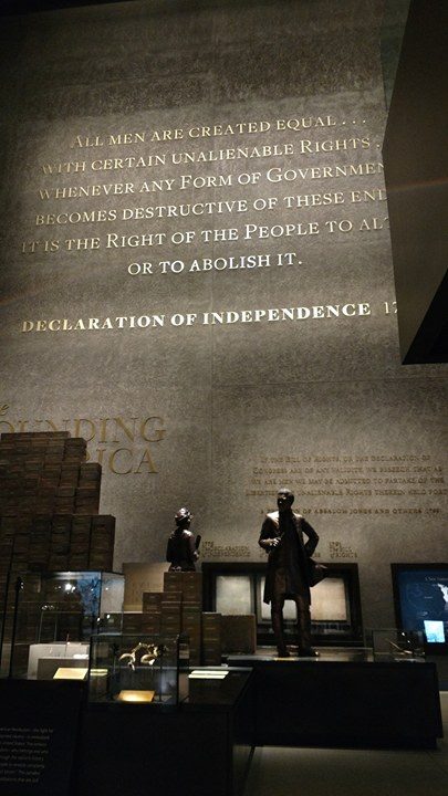
17410088_10155921637247926_1659969188_n

One of the most striking images in the museum, for me, is pictured above. The words of the Declaration of Independence are hung on for the wall for all to see. Below it, the struggles and accomplishments of enslaved people are discussed. This is truly the “Paradox of Liberty,” as evident in the museum’s exhibit text. While our textbooks glorify men like Thomas Jefferson or George Washington, African-Americans are often pushed to the perimeter. For decades, the American experience and our country’s history textbooks are informed by the accomplishments of white men. NMAACH fills in the blanks, highlighting figures that sacrificed just as much (if not more) than our early presidents.

My favorite object in the entire museum was a book from Phyllis Wheatley, an African-American poet that wrote during the American Revolution. The 18th century is one of my favorite time periods to study and I believe Phyllis Wheatley to be a trailblazer. Many slaves, let alone female slaves, could not read or possess the ability to become a published author. She felt that her voice needed to be heard and her story wasn’t being told by 18th-century American society.

17409810_10155921637197926_374042340_n

2014.273.8, The Poems of Phyllis Wheatley. Collection of the Smithsonian National Museum of African American History and Culture, Gift of M. Denise Dennis, in honor of the Dennis Family.

The visit to NMAACH drove home for me the responsibility that museums have to the public. Our museums have historically been colored by a white, European view of thinking. While beautiful and part of our unique story, this viewpoint should not be all-encompassing. It is important to document our country’s struggles, no matter how painful or uncomfortable, to ensure that our American story can be documented as fully as possible.